Brand Health Tracking
Designing for clarity in longitudinal research
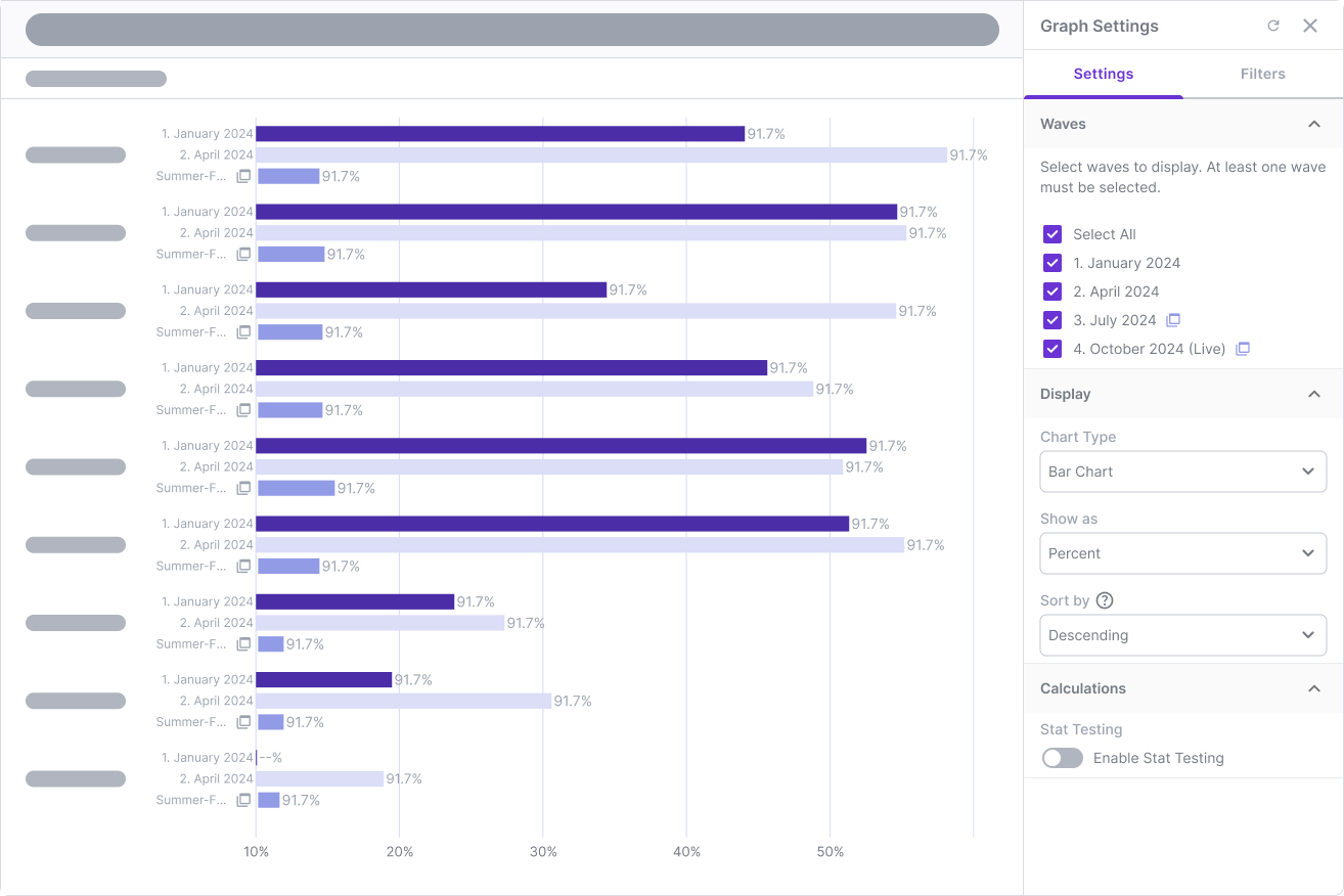
How we laid the groundwork for a more robust, customizable way to interpret brand health over time—even if the build never launched.
Timeline
Q2 2024
Role
Lead UX Designer
Collaborators
Product Manager / Engineers
Commercial / Research Stakeholders
Platform
Suzy (B2B SaaS)
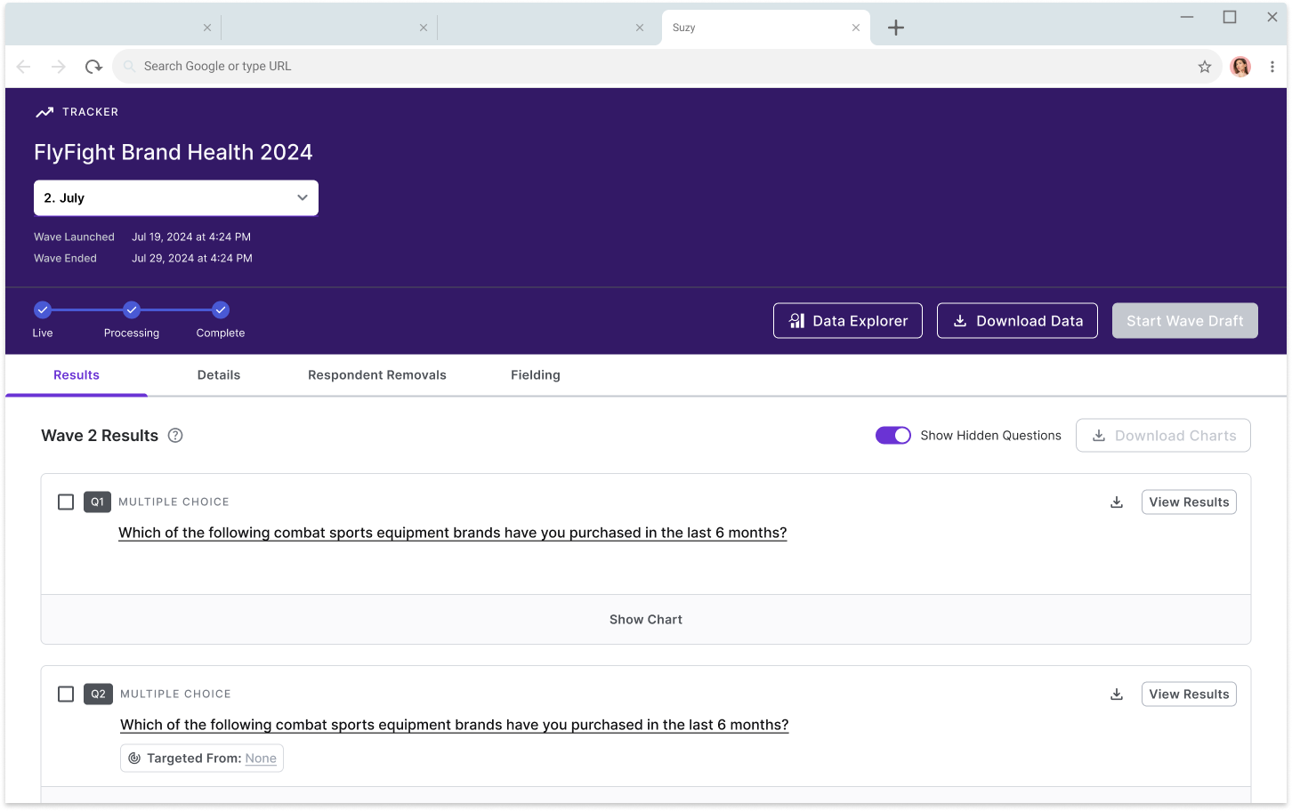
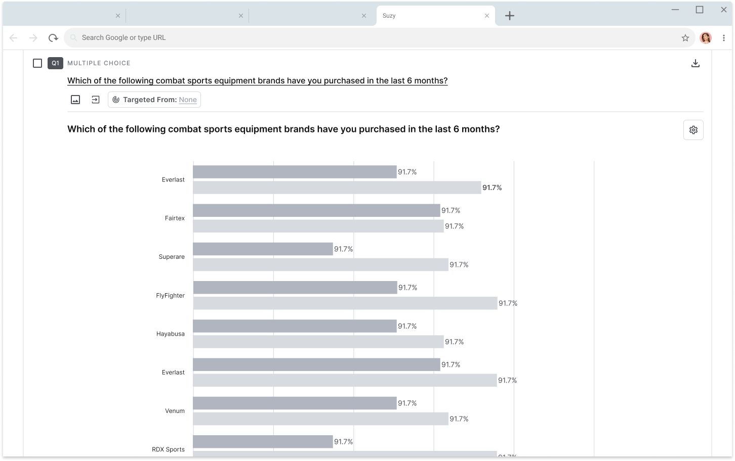
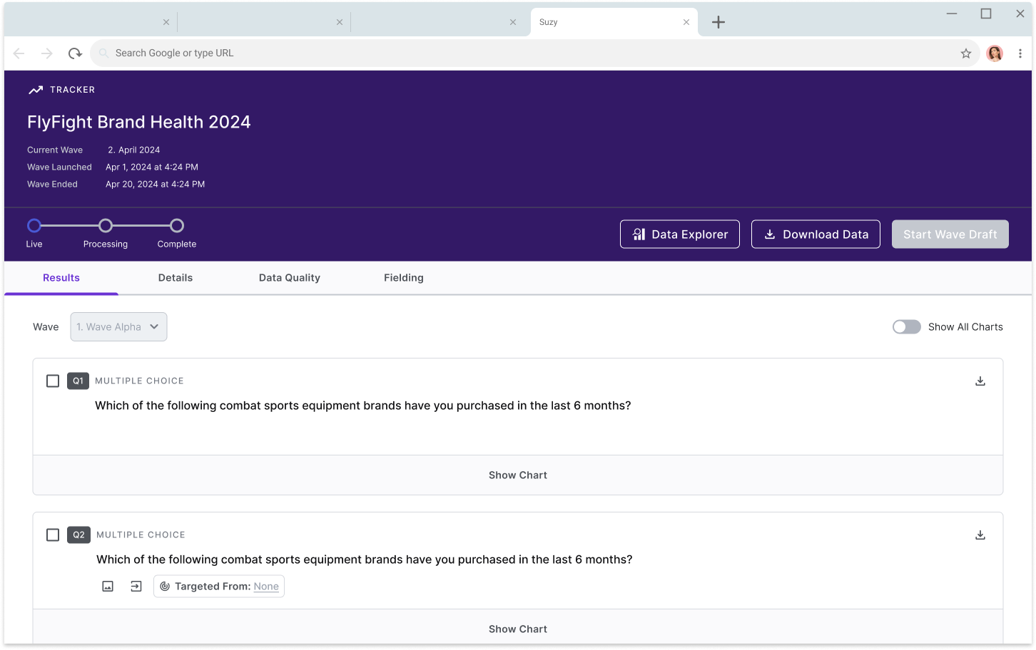
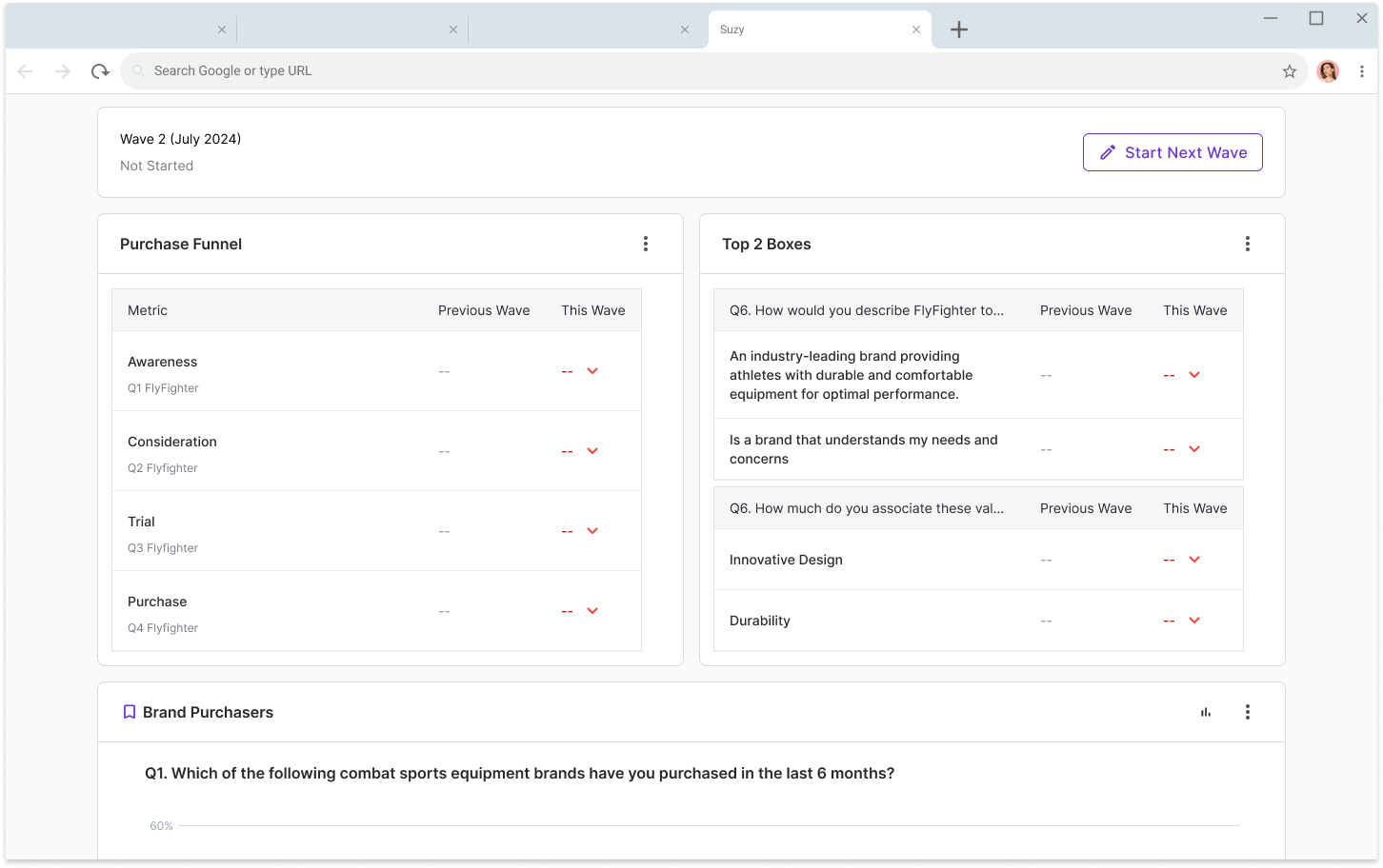
Early wireframe concepts
The Challenge
Suzy’s enterprise customers rely on brand trackers to monitor shifting perceptions over time—metrics like awareness, favorability, and purchase intent. But our tools for viewing results weren’t meeting expectations. Most users downloaded raw data or recreated visuals in Excel just to see basic trends.
Over the course of three months, I led UX for a new Brand Tracker Results experience. The goal was to bring clarity, context, and flexibility to longitudinal reporting. I collaborated with Product, Engineering, the internal research Center of Excellence, and Client Success to get a full view of what was needed. It was important to understand the end-to-end experience of setting up and interpreting brand trackers—then design something that felt robust without being overly complex.
The feature was ultimately paused due to engineering reprioritization, but the work we did laid important groundwork for Suzy’s broader reporting roadmap.
Discovery & Alignment
Framing the Opportunity
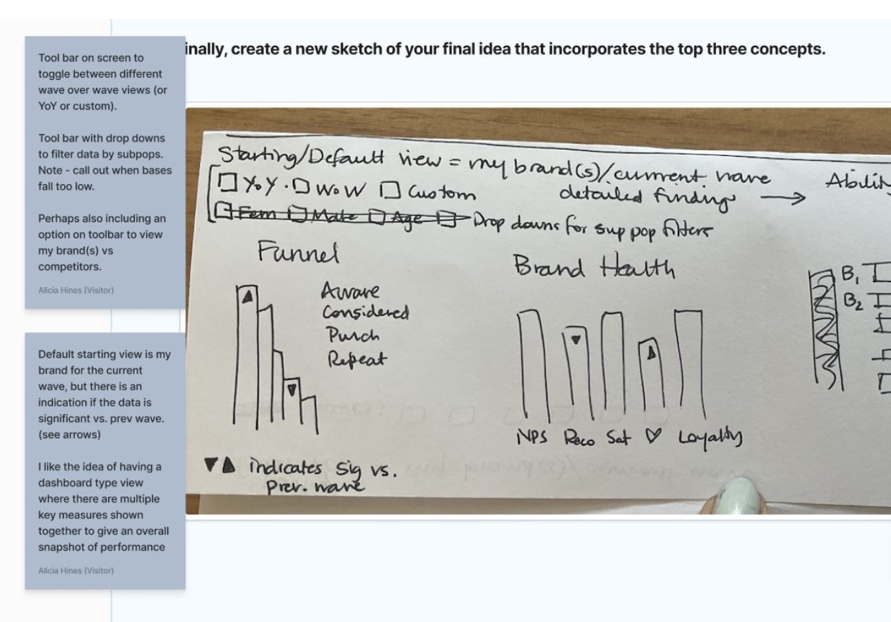
We had growing demand from enterprise customers to support longitudinal brand health tracking—monthly, quarterly, or otherwise recurring surveys designed to measure perception over time. But at the time, there was no clear way to compare multiple waves or cohorts within the platform itself.
We reframed the opportunity: How might we help users compare brand tracker results over time, within a unified experience that balances rigor and ease of use?
Initial Research & Competitive Analysis
Through internal interviews, support logs, and a competitive audit of Qualtrics, Zappi, SurveyMonkey, and Attest, we found:
Default views often failed to answer the most common questions (e.g. "Are we improving?")
Stat testing was inconsistently surfaced, if at all
Researchers wanted comparative views by default, not buried in filters
Stakeholder Alignment
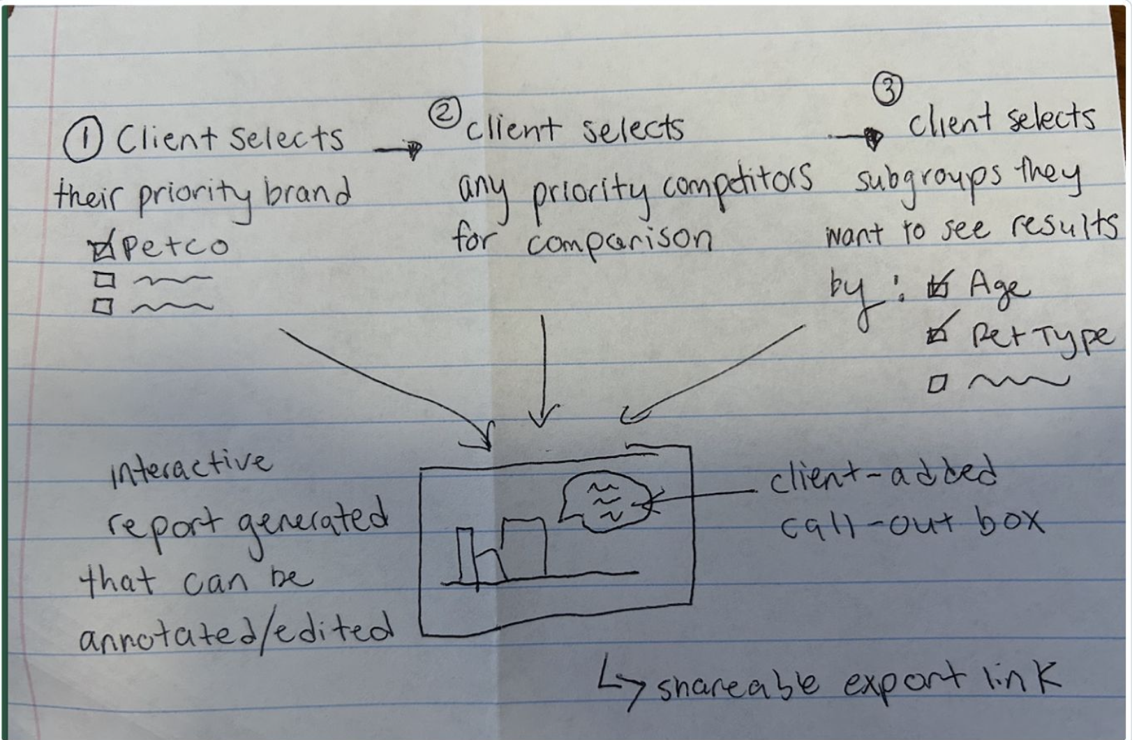
Sales pushed for sleek exports. Researchers wanted filters. Data teams needed to minimize misinterpretation. We conducted two prioritization workshops, using MoSCoW and journey mapping to align on a v1 scope that emphasized:
Wave-over-wave comparisons
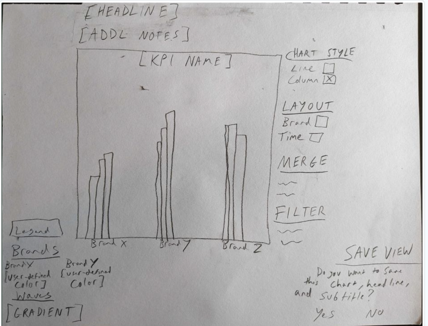
Smart chart defaults with filter flexibility
Extensible architecture for custom views and AI overlays
Key Challenges While Gathering Requirements
Early questions included:
How do we represent edits to questions across waves?
Should charts update in real time or wait for data cleaning?
Where does this experience live: Results, Data Explorer, or its own view?
Process & Approach
This was one of the most alignment-heavy projects I worked on. The ambiguity around scope, combined with ongoing platform migration efforts, made execution hard to lock.
Creating a Uniform Language for Data Visualization Settings
We built a behavior matrix for filters, toggles, and benchmarks—outlining edge cases and defaults to support scalable design. This documentation helped:
Developers implement consistent logic across chart types
Researchers understand what they were seeing and why
Generative AI Opportunities
While not prioritized for v1, we explored AI-assisted summaries and thematic tagging of open ends. This included early concepts for an AI-enabled “Tracker Overview” tab, which would intelligently map answer options and response behavior across brand health metrics. These ideas led to design concepts for text open-end clustering, metric trend summaries, and relevance scoring—and UI and interaction patterns later picked up by other teams.
Bottlenecks
Platform constraints slowed backend support for dynamic benchmarking. Meanwhile, our permissions model lacked support for shared custom views.
As design progressed, we also encountered stakeholder misalignments mid-flight—with shifting interpretations of what was required for MVP versus what was a nice-to-have.
This underscored the need to design a modular system, so that features like custom dashboards or tailored charts could be introduced iteratively based on user needs and resourcing. Our designs reflected this flexibility, enabling teams to build toward a personalized insights experience over time.
Feature Reprioritization
Midway through frontend implementation—with several Tracker Results components already in active build the initiative was shelved indefinitely due to a broader company pivot toward a different strategic direction.
This shift in priorities reinforced the importance of building the Tracker Results experience in a modular and systemized way. We structured the interface with flexible, reusable components. This approach enables individual pieces to be shipped iteratively, depending on future needs and resourcing.
The design supports future rollout of custom-tailored charts, dashboards, and insights views as product strategy evolves.
Design Patterns & Principles
-
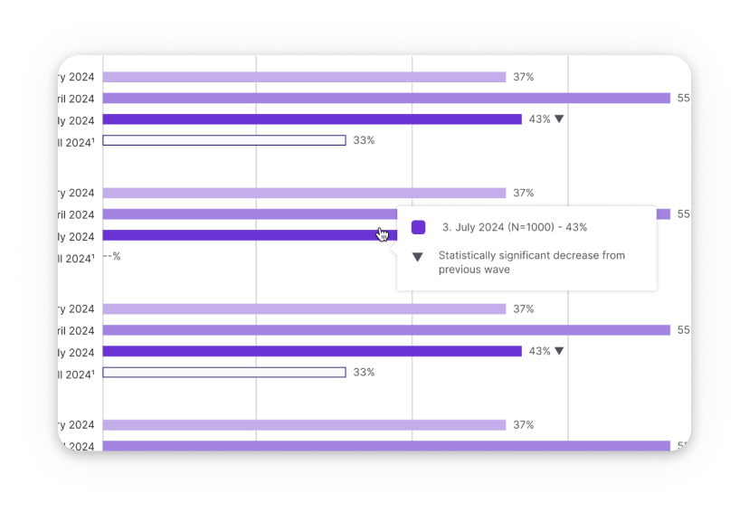
Contextual clarity
Every chart included wave labeling, sample sizing, and significance indicators. We labeled in-progress data as "live" to avoid premature decision-making.
-
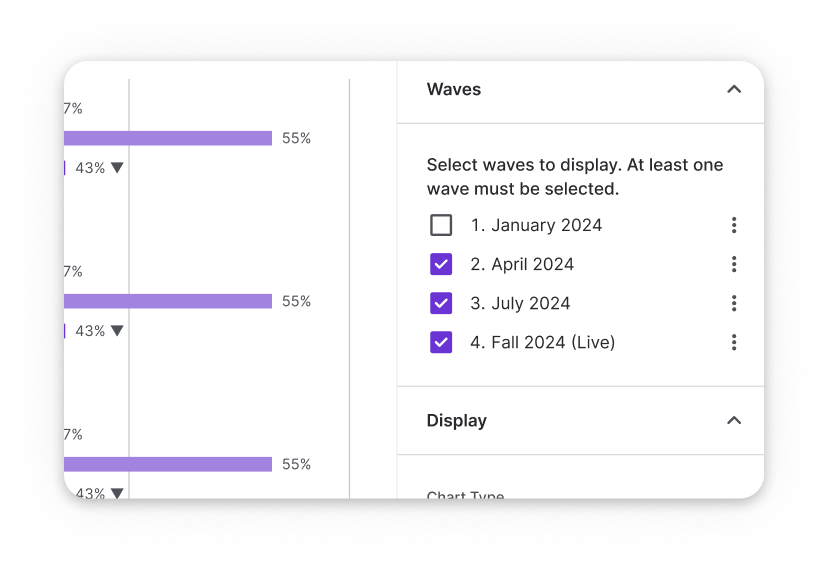
Controlled flexibility
Users could toggle between demographic filters, segment views, and wave-over wave comparisons across question types without overloading the interface. We defaulted to "most recent waves" and allowed users to show previous data points at will.
-
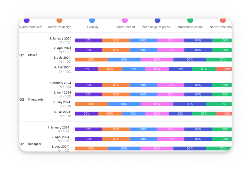
Visual Consistency
A unified visual language spanned chart types: bar graphs, stacked bars, and line charts. This included legend behaviors, settings panels, and chart annotations.
Highlights
-
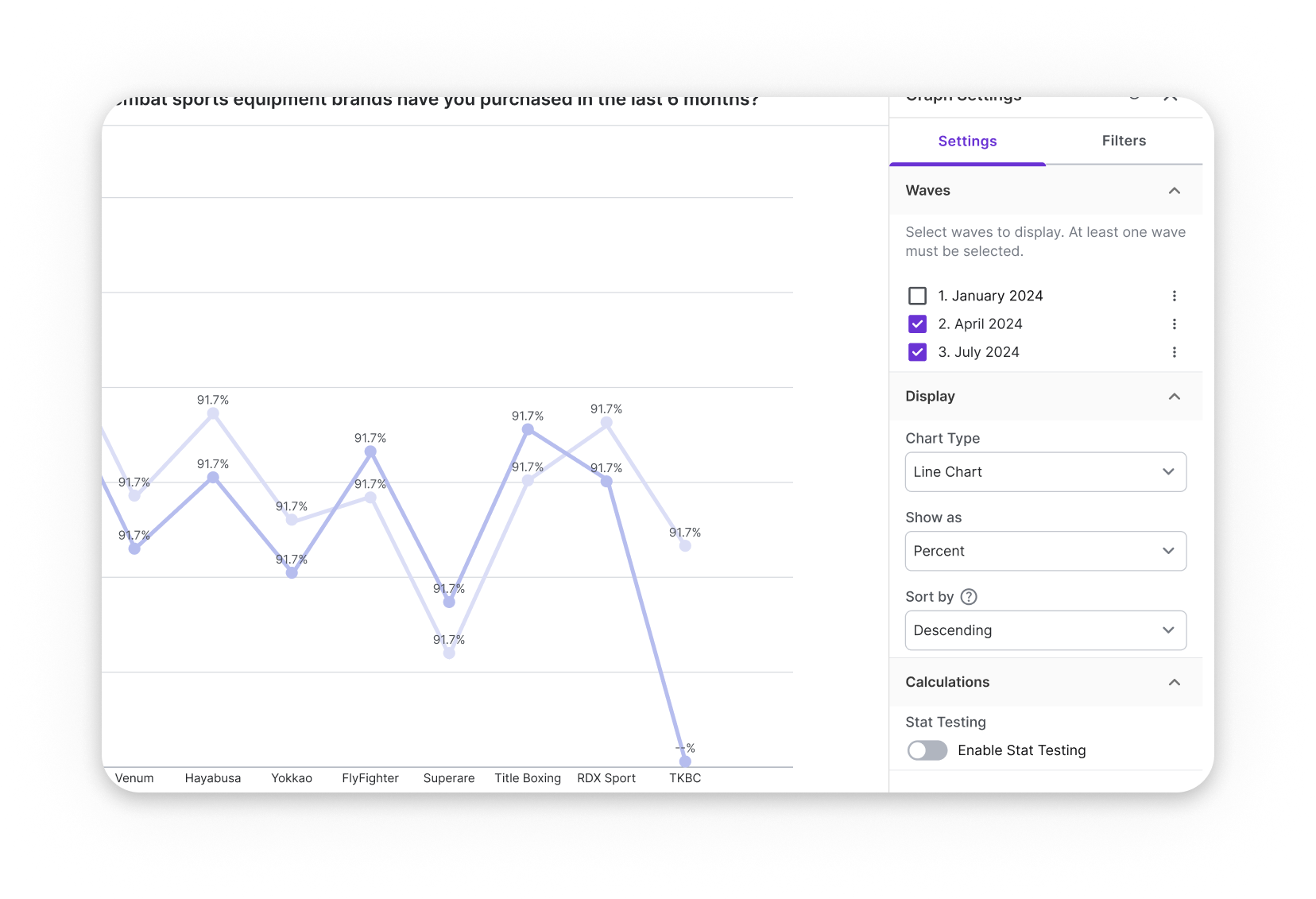
User Centric Chart Defaults
Early usability testing revealed that while some users wanted the option to view all waves at once, most were primarily interested in comparing the last two waves. We used this insight to guide our default chart behavior. The logic prioritized the most recent waves and highlighted directional changes, helping users interpret trends quickly without needing to adjust settings manually.
-
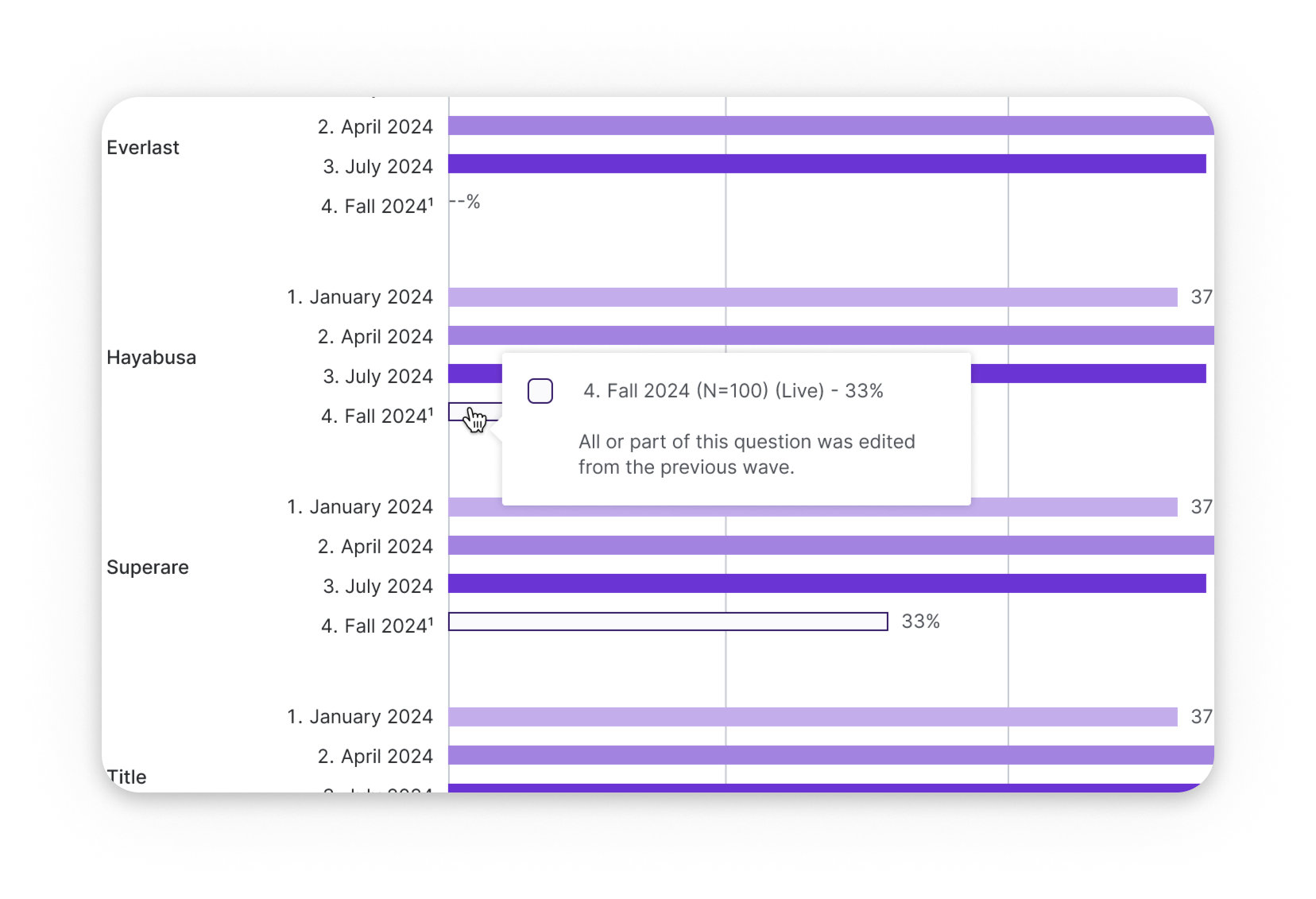
Hidden & Edited Question Treatment
Brand Tracker surveys often involve incremental edits over time. We introduced a treatment for questions that were hidden, altered, added, or edited between waves. This approach ensured consistency, especially between multiple choice and grid question types that appeared across trackers.
-
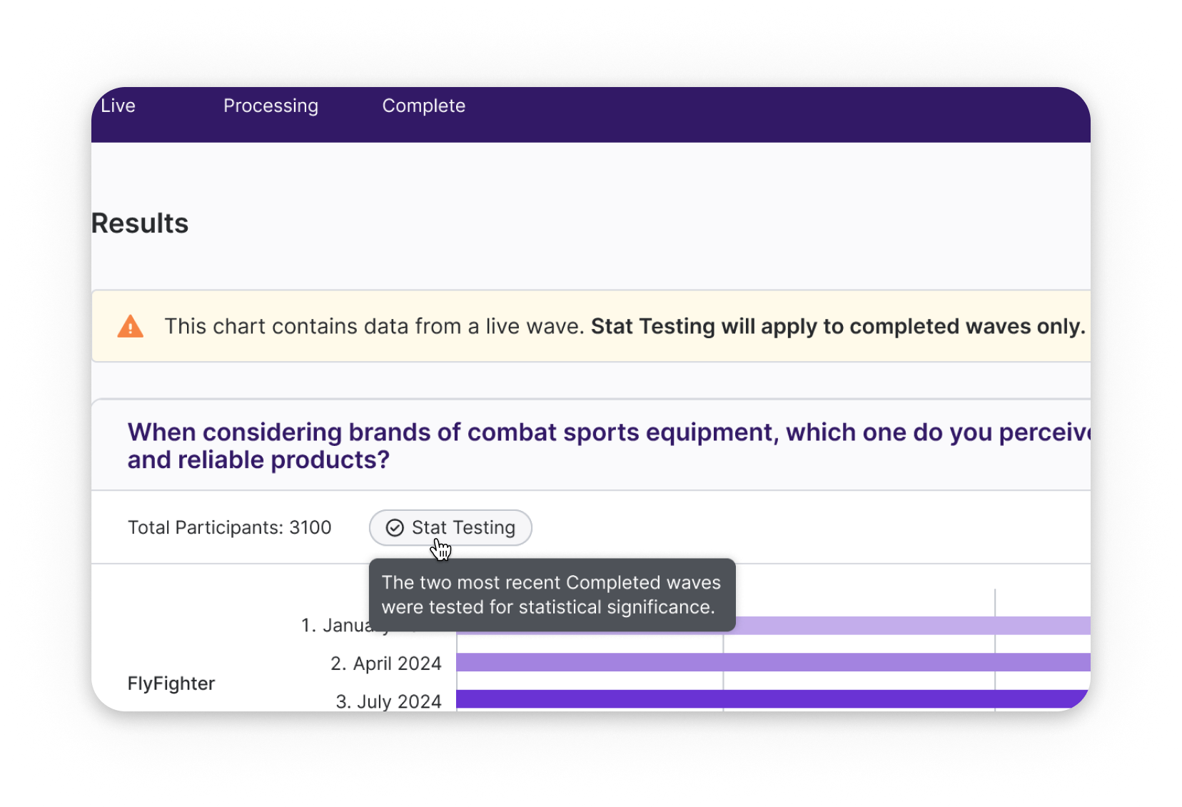
Statistical Testing Guardrails
If a user edited a question within a new tracker wave, we added badges and tooltips to flag that comparisons might not be valid. We partnered with analysts to design how stat testing should appear in charts. This included where to display this calculation option, how to clearly show statistical significance, and how to support better decisions without adding noise.
-
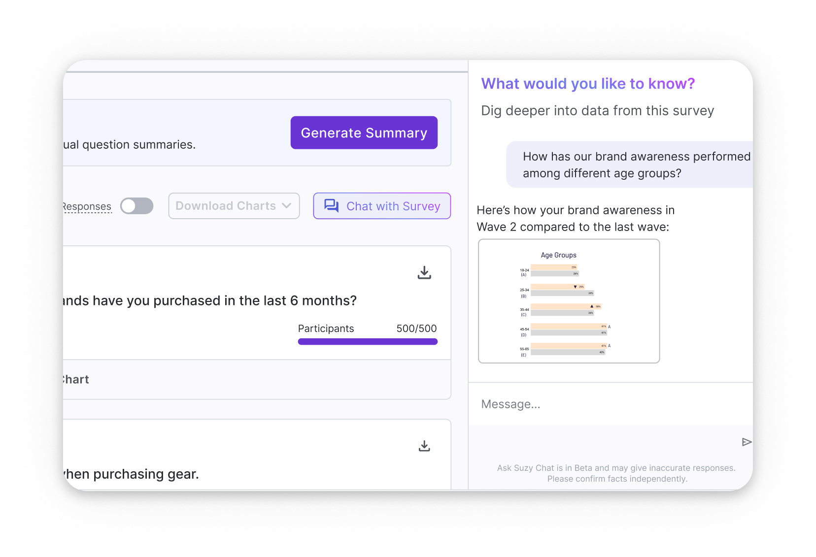
AI-Powered Inquiries
We also explored early concepts around AI-powered inquiries, allowing users to "chat” with survey and tracker data. This vision included asking natural language questions and receiving charted results in response. These ideas aimed to make complex longitudinal analysis more approachable, especially for non-research stakeholders.
Aftermath & Impact
While the Tracker Results feature didn’t launch as planned, it still left a lasting impact across the organization. Our work laid the foundation for future improvements and sparked important conversations about platform strategy.
Several updated components and flows were added to the backlog for incremental rollout
The project's pause mid-build was a signal of deeper platform limitations and helped catalyze cross-functional discussions about replatforming
Our modular, flexible design system positioned the Tracker Results experience to be revived or repurposed based on future user needs
The Next Steps
Repurpose UI components and patterns for Results 2.0 and AI-generated outputs (summaries, data viz, etc)
Explore AI clustering for qualitative results (text or video open ends) on single and multi-wave experiences
Build infrastructure to support custom views and saved comparisons
Revisit brand tracker MVP when platform migrations stabilize
•
LAST WORDS
• LAST WORDS
Some features might not ship, but they can still shape the future of a product. Working on Brand Tracker results taught me how to:
Align stakeholders across conflicting priorities
Document behavior logic for implementation clarity
Design with foresight, even when timelines shift
It reaffirmed a core belief in supporting cross-functional clarity, building internal trust, and creating systems that can grow over time. Even when features don’t ship right away, a modular foundation makes it easier to roll out meaningful improvements for users.